The following guide is intended to help creative professionals and marketers learn the best practices for designing content for digital signage campaigns.
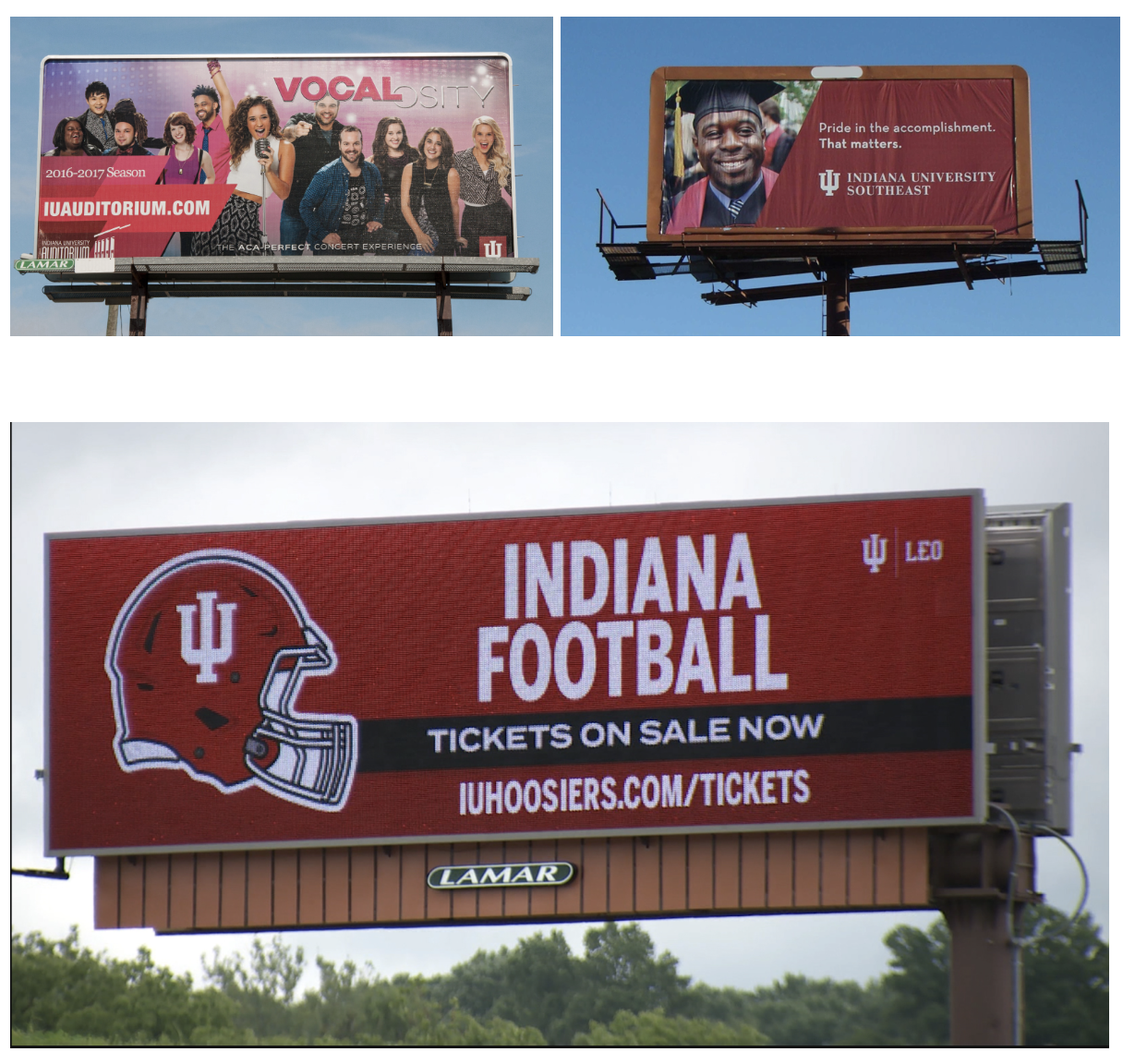
We can get a lot of inspiration from billboard advertising to create effective digital signage campaigns, the main difference being that instead of moving vehicle traffic we are dealing with human foot traffic.
Since we are dealing with varying types of foot traffic - moving fast or slow and at varying distances - we need to make careful design considerations when creating content for digital signage purposes.
The call to action is the main focus.
Whether it’s to visit a website or to spread awareness or critical info about an entity or cause, your call-to-action is the prime objective. Design with the main goal in mind to direct the viewer’s focus on the call to action. Adding some creativity to the CTA can help amplify the message. The call-to-action is the most important component of any digital signage campaign and it should be bold and prominent. Make sure there is adequate contrast between type and background.

K.I.S.S.
Most viewers won’t have time to read the details. The larger and clearer your design elements, the better chances your content will be noticed. Large bold images and fonts make it easier for a person walking past to read the message. Consider that most people will not stop and stare. Less is definitely more when designing your campaign.
Make a lasting impression to encourage memory in the viewer.
"Clear and easy to read" should guide every design decision, but while also being eye-catching. When you design your content, think of the story that you want to tell. Don’t burden your viewers with too many words. Instead use a clear single image to tell a story about your event or initiative. Make it bold and colorful using IU branding colors. Avoid cursive or decorative typography and as a general rule use IU branded fonts.

Can the content be read in 15 seconds?
Because viewers only have time to see and comprehend seven words when moving at a high rate of speed, a widely accepted best practice in billboard advertisements is to keep it to seven words or less. Digital signage involves pedestrian traffic so we can afford more time, but all the graphics and text should ideally be digested within 15 seconds.
Use a URL for your call-to-action.
Consider using a custom go.iu.edu URL for your CTA. Custom go.iu.edu URLs also include a QR code and analytics. Request a custom go.iu.edu URL.
Make sure your content is accessible by visually disabled persons.
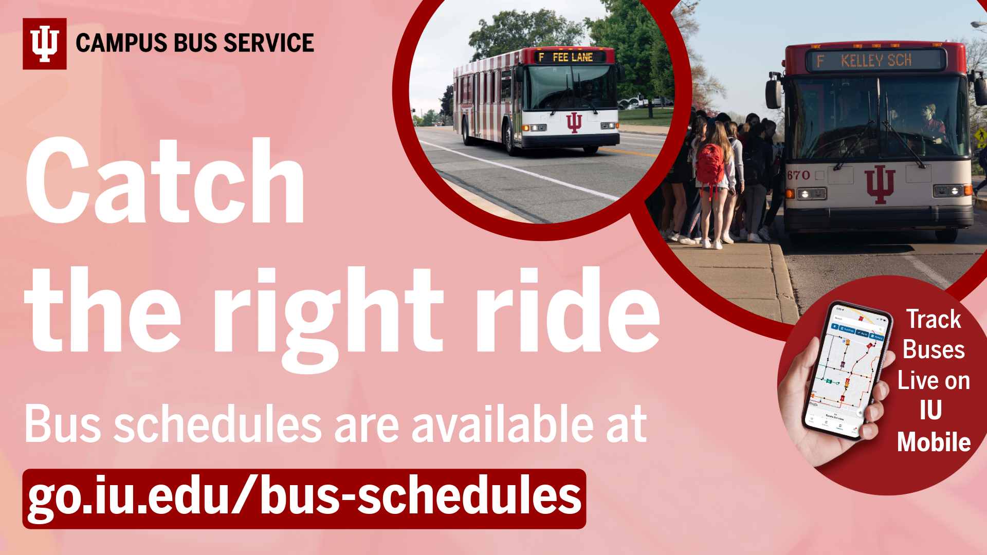
Your digital signage content is required to be acessible to individuals who are visually disabled. Please review this KB article - Accessibility for digital signage content creation and design. Another great resource for learning about accessibility is https://accessibility.iu.edu/ The following image is a good example of content properly formatted for digital signage, but there is one accessibility issue. Can you spot it? Focus your attention on the text above the custom go.iu.edu URL. A color contrast issue exists with the “Submit a Care Referral:” text and its background.
Reduce wherever possible.
In the final stages of production ask yourself - is every design element crucial to the campaign's objective? Resist the temptation to add too many graphics or text which potentially distracts from the CTA. Any repetition or redundancy should be removed. Designs meant for print (or even websites) usually require a significant amount of reduction to be properly formatted for digital signage. Because all people have varied "sightedness", the design should always aim to be easily readable. To receive the best possible viewer engagement, reduce the size of decorative graphics in exchange for enlarging the most important info - the call to action.


